Post by L. T. Dangerous on Dec 27, 2012 17:07:10 GMT
This is a post I've wanted to do for a good long time on the Tumblr and I thought I'd also pop it on here! Do note this is long and image heavy.
EDIT: Also, it's doing a wee on my Photobucket's bandwidth so if a picture doesn't load try this link: amomentofsonicthecomic.tumblr.com/post/38958959062/the-evolution-of-richard-elsons-sonic.
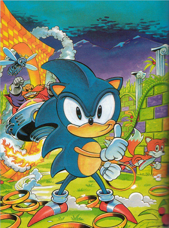
For many readers, their introduction to Richard Elson's Sonic art was the 1992 Sonic the Hedgehog Annual. These annuals are not part of STC continuity (except, it is generally agreed, the Shinobi story) but we're not concerned with that when the art looks this good. Fleetway were obviously well underway with planning for STC at this point and Elson will have definitely caught their eye with art of this calibre.
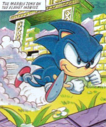
From "Cartoon Concerto" in the same annual. Apologies for the low resolution image. This Sonic is small, cute and cheeky looking.
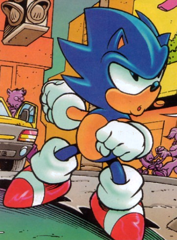
From issue 8's "Super Sonic", Richard's first issue. His art absolutely set STC on fire as it was of a much superior quality to almost everything that had come before on the lead strip. Richard had four consecutive issues on the lead strip on his first run and it's my very firm belief that these issues with Nigel Kitching's stories and Richard's art are what saved STC from an early death.
From the same issue, Sonic's back, which is a weird sort of pine cone at this stage. As you may well note, it doesn't actually match the front and Richard was one of the artists that later instituted a much better rear-view of the hedgehog. Obviously, we don't see Sonic from the back very much!
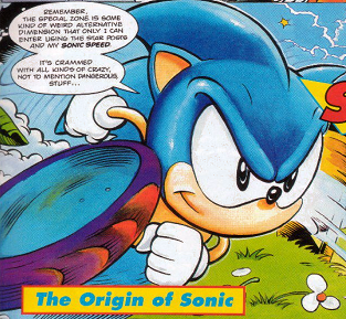
For issue 9's "The Origin of Sonic", Richard went with an unusual colouring style that he never used again. It made the colourful world of the Special Zone pop out in a unique way.
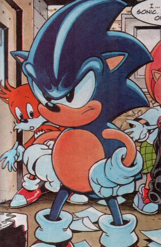
Issue 18 gave us "Casino Night Part 1" which is monumentally important to STC's early days. Nigel K had been pushing for multiple-part stories on the lead strip for quite some time and finally got his wish. The success of this story led to Nigel later being allowed to write the five-part "The Sonic Terminator" as well as, naturally, many other multiple-part stories throughout STC- the comic later had Sonic-universe stories that ran for as many as six parts, the legendary "The Return of Chaotix" being one such story. Anyway, the point is, this is lovely and so is the art- at this point, Elson's finding his own niche for drawing Sonic. His limbs are a little longer and Sonic's a little more expressive, with the cheekiness being lost a little bit.
And here's his back from the same issue. Still a pinecone.
Issue 33 introduces Knuckles to the main comic in the suitably titled "Enter Knuckles Part 1". Sonic's spines are now more of a "Christmas tree" shape, which is how he'd be seen from the front and back for a good long while now. The colouring is just a notch darker too.
Issue 45's "Day of the Death Egg" is utterly fantastic and here's Sonic's "Christmas tree" spines from behind. This is a from-behind design that influenced many STC and STC-O artists in drawing rear-views of Sonic.
By the time we get to issue 76's "The Big Decision", Sonic is a little darker again and also somewhat shinier.
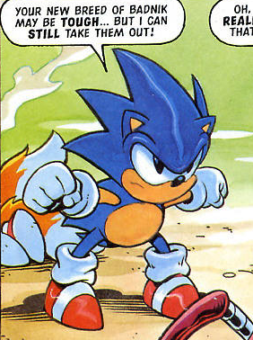
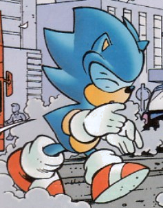
In the incredible issue 100's "The Final Victory Part 1", we get a few good shots of Sonic. This one seemed like a good candidate. Note the extra detail on the gloves and footwear compared to earlier issues.
By the time we get to issue 104 and "Flickies' Island Part 1", Richard was most likely considering a change in the way he drew Sonic- which we'll see shortly. In light of this, note how Sonic seems more compact and squat here, which would later be offset by...
...The upwards spines. As seen here in "The Evil Empire Part 1" from issue 108. This was a design change implemented so Sonic matched the box art to Sonic 3D. It is one of the less popular Sonic design choices from over the years.
Sometimes the upwards spines look very strange, as seen here in this picture from issue 118's "Best of Enemies Part 3".
Issue 130 is legendary and iconic, and it's a fine example of Richard's early foray into computer colouring. The colours are vibrant but perhaps just a little toovibrant. Sonic's also quite shiny in a lot of these stories. And those upward spines!! This is from "Showdown Part 3".
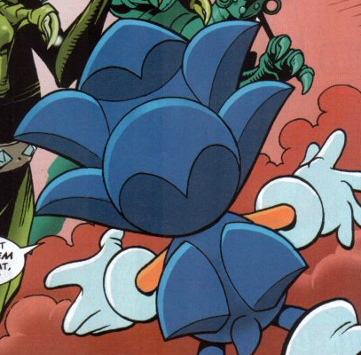
They really messed with Sonic rear-views. His head doesn't look entirely attached here. This is from the same story as above.
This is from issue 135's "Roots Part 1" and is a fantastic example of Richard's art from around this time. He's getting more practiced with the computer colouring, as you can see.
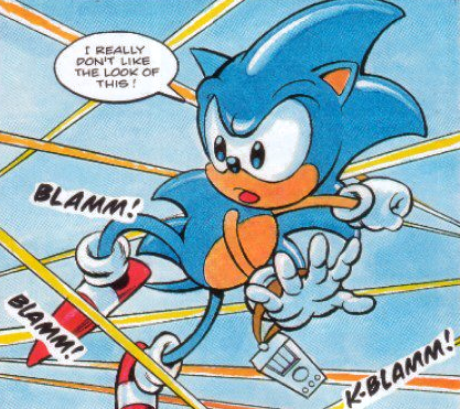
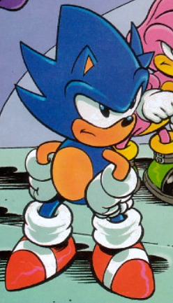
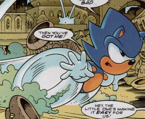
This might just be the ULTIMATE Richard Elson pose. One arm back, fists clenched, mouth in an O. Every artist has their standards to fall back on and this one never failed to create a sense of urgency in whichever character made it. This is from "Secret Enemy Part 2" in issue 144.
Nigel Kitching coloured this one from issue 147's "Earth Attacks Part 2", but I had to post is because those spines are noticeably different. Very short.
Similar sort of image of the spines to the one above here, from issue 157's "No Escape Part 2", as coloured by Richard himself this time.
Issue 160's "Knightmares" gives us a great rear-view that shows off those upward spines. Nearly done with them now
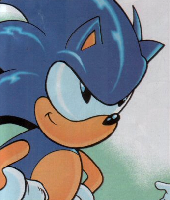
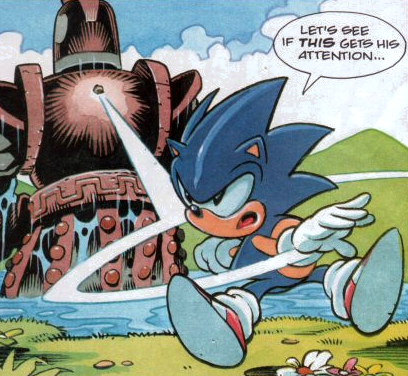
Ooh, this is interesting. In issue 175's "The Coming of Chaos", the spines are down again and Sonic's shiny in a different way. But here's the likely reason why the spines are back down:
At the end of the story, Sonic's spines change design drastically so Sonic could match his Sonic Adventure appearance. Some readers have commented that they aren't terribly keen on this change and I'm one of them, but that's because I'm a traditionalist when it comes to Sonic's design and I understand this was a necessary move to tie in with the game.
Here's issue 176's cover to show the new spines better. Also new eyes. And also teeth (those, mind you, weren't a regular thing!).
I'll spare you dozens of Elson covers from this point on until STC's demise as, naturally, there's not much difference between them. But I'll finish with this, two versions of the cover from issue 256 (which, you may remember, I actually proudly own the pencil art to!):
The cover as coloured by Matthew Allen Smith.
And as coloured by Pete Murphy. I prefer this version, personally.
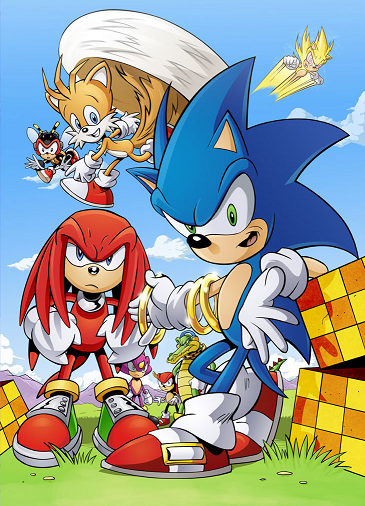
Even after STC's original demise, Richard's Sonic continues to evolve. One thing is a constant, however, throughout his tenure: he's one of the greatest artists to ever professional draw Sonic the Hedgehog, perhaps the greatest.
EDIT: Also, it's doing a wee on my Photobucket's bandwidth so if a picture doesn't load try this link: amomentofsonicthecomic.tumblr.com/post/38958959062/the-evolution-of-richard-elsons-sonic.
For many readers, their introduction to Richard Elson's Sonic art was the 1992 Sonic the Hedgehog Annual. These annuals are not part of STC continuity (except, it is generally agreed, the Shinobi story) but we're not concerned with that when the art looks this good. Fleetway were obviously well underway with planning for STC at this point and Elson will have definitely caught their eye with art of this calibre.
From "Cartoon Concerto" in the same annual. Apologies for the low resolution image. This Sonic is small, cute and cheeky looking.
From issue 8's "Super Sonic", Richard's first issue. His art absolutely set STC on fire as it was of a much superior quality to almost everything that had come before on the lead strip. Richard had four consecutive issues on the lead strip on his first run and it's my very firm belief that these issues with Nigel Kitching's stories and Richard's art are what saved STC from an early death.
From the same issue, Sonic's back, which is a weird sort of pine cone at this stage. As you may well note, it doesn't actually match the front and Richard was one of the artists that later instituted a much better rear-view of the hedgehog. Obviously, we don't see Sonic from the back very much!
For issue 9's "The Origin of Sonic", Richard went with an unusual colouring style that he never used again. It made the colourful world of the Special Zone pop out in a unique way.
Issue 18 gave us "Casino Night Part 1" which is monumentally important to STC's early days. Nigel K had been pushing for multiple-part stories on the lead strip for quite some time and finally got his wish. The success of this story led to Nigel later being allowed to write the five-part "The Sonic Terminator" as well as, naturally, many other multiple-part stories throughout STC- the comic later had Sonic-universe stories that ran for as many as six parts, the legendary "The Return of Chaotix" being one such story. Anyway, the point is, this is lovely and so is the art- at this point, Elson's finding his own niche for drawing Sonic. His limbs are a little longer and Sonic's a little more expressive, with the cheekiness being lost a little bit.
And here's his back from the same issue. Still a pinecone.
Issue 33 introduces Knuckles to the main comic in the suitably titled "Enter Knuckles Part 1". Sonic's spines are now more of a "Christmas tree" shape, which is how he'd be seen from the front and back for a good long while now. The colouring is just a notch darker too.
Issue 45's "Day of the Death Egg" is utterly fantastic and here's Sonic's "Christmas tree" spines from behind. This is a from-behind design that influenced many STC and STC-O artists in drawing rear-views of Sonic.
By the time we get to issue 76's "The Big Decision", Sonic is a little darker again and also somewhat shinier.
In the incredible issue 100's "The Final Victory Part 1", we get a few good shots of Sonic. This one seemed like a good candidate. Note the extra detail on the gloves and footwear compared to earlier issues.
By the time we get to issue 104 and "Flickies' Island Part 1", Richard was most likely considering a change in the way he drew Sonic- which we'll see shortly. In light of this, note how Sonic seems more compact and squat here, which would later be offset by...
...The upwards spines. As seen here in "The Evil Empire Part 1" from issue 108. This was a design change implemented so Sonic matched the box art to Sonic 3D. It is one of the less popular Sonic design choices from over the years.
Sometimes the upwards spines look very strange, as seen here in this picture from issue 118's "Best of Enemies Part 3".
Issue 130 is legendary and iconic, and it's a fine example of Richard's early foray into computer colouring. The colours are vibrant but perhaps just a little toovibrant. Sonic's also quite shiny in a lot of these stories. And those upward spines!! This is from "Showdown Part 3".
They really messed with Sonic rear-views. His head doesn't look entirely attached here. This is from the same story as above.
This is from issue 135's "Roots Part 1" and is a fantastic example of Richard's art from around this time. He's getting more practiced with the computer colouring, as you can see.
This might just be the ULTIMATE Richard Elson pose. One arm back, fists clenched, mouth in an O. Every artist has their standards to fall back on and this one never failed to create a sense of urgency in whichever character made it. This is from "Secret Enemy Part 2" in issue 144.
Nigel Kitching coloured this one from issue 147's "Earth Attacks Part 2", but I had to post is because those spines are noticeably different. Very short.
Similar sort of image of the spines to the one above here, from issue 157's "No Escape Part 2", as coloured by Richard himself this time.
Issue 160's "Knightmares" gives us a great rear-view that shows off those upward spines. Nearly done with them now
Ooh, this is interesting. In issue 175's "The Coming of Chaos", the spines are down again and Sonic's shiny in a different way. But here's the likely reason why the spines are back down:
At the end of the story, Sonic's spines change design drastically so Sonic could match his Sonic Adventure appearance. Some readers have commented that they aren't terribly keen on this change and I'm one of them, but that's because I'm a traditionalist when it comes to Sonic's design and I understand this was a necessary move to tie in with the game.
Here's issue 176's cover to show the new spines better. Also new eyes. And also teeth (those, mind you, weren't a regular thing!).
I'll spare you dozens of Elson covers from this point on until STC's demise as, naturally, there's not much difference between them. But I'll finish with this, two versions of the cover from issue 256 (which, you may remember, I actually proudly own the pencil art to!):
The cover as coloured by Matthew Allen Smith.
And as coloured by Pete Murphy. I prefer this version, personally.
Even after STC's original demise, Richard's Sonic continues to evolve. One thing is a constant, however, throughout his tenure: he's one of the greatest artists to ever professional draw Sonic the Hedgehog, perhaps the greatest.